Showing posts with label review. Show all posts

Monday, October 1, 2012

Philadelphia Museum of Art: A Review of the Extraordinary and Observation of the General

In my return to the Philadelphia Museum of Art, my spirit mimicked Rocky's triumph as I spent the day exploring the dozens of different rooms instead of sitting in traffic in Los Angeles. I was, however, hoping for a larger collection of contemporary art, but I'd wager museums like this one are hesitant to display much contemporary work until the art has aged and proved to survive the decades. Nevertheless, this museum is an inspirational place, full of extraordinary works from over the centuries and around the world. And while this post is an attempt to understand and describe what I found to be inspirational in my quest, my observation of the other viewers at the museum also gave me insight into the world of art.


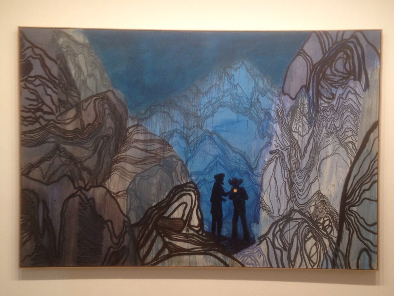
It seems that the general public wants to be sure they can like an artist, and in doing so they look for clues such as conservative subject matter, an art degree, or an artist's ability to draw realistically in the traditional western style. To the general public, these are easy guidelines to rely on when determining what artists are likable. But these guidelines are human fabrications, and while guidelines are good for a functional society, they don't necessarily transfer over to good art. 

People want structure in life. They want security. Generally, when the general public observes art, they prefer to see objects that they can imagine putting on their walls at home. But their homes are places of structure, security, and refuge. Most people want to decorate their homes and create comforts, and maybe this is a reason why the most trafficked areas at the museum were around impressionist and post-impressionist paintings (Monet, Renoir, Cezanne, Van Gogh, etc.) of gardens, flowers, boaters, pleasant women, and beautiful landscapes.

In the practice of law, indeed it is structure, logic, and reasonableness that are important. These are important in almost all aspects of society but often erroneously carry over to art appreciation. Humans are more complex than these artificial constructs and institutions, and art must therefore not be inhibited by such falsities.

Many successful artists have broken free of structures in creating work representative of the human condition. Museums continue to fill rooms with strange works that contradict feelings of warmth and safety of the home. Picasso was a great artist because he led the charge in tearing down certain walls and crossing boundaries with his wide range of inventing new styles. The viewer must also free himself of shackles. Painting must not be judged by its ornamental qualities.

The most obvious reaction I perceived came from a guy at the Cy Twombly room, located off the very end of the hallway of the "Contemporary and Modern Art" wing. Cy Twombly (1928-2011) was known for creating huge canvases covered in scribbles and scrawls using crayons and graphite. As I walked down the hallway toward the room, a guy was walking with a woman next to me. He said to her, "Let's see if there's anything else down here." He paced to the end of the hallway and glanced into the Twombly room, frowned, and immediately said: "No, there's nothing down here." And they left.

I kept walking and entered the room solo:


The following painting, called Fifty Days at Iliam: Achaeans In Battle (1978), shows Twombly's influence from Greek mythology.


I'm not writing this attempting to defend Twombly's work as good art, but I was more interested in the stranger's lightning quick decision to disregard the entire room before even setting foot in it. The graffiti-like scribbles did not conform to his traditional notions of what a painting should be, so he basically gave it the middle finger and stormed off.

Certainly museums would bore us to death if everything in it was an impressionist painting. What I appreciate about Twombly's work (perhaps symbolized by its location in the last room at the very end of the hallway) is that it sits at the end of the spectrum of the norm's expectation of what a painting should be. In that regard, his work is similar to the famous Fountain, by Marcel Duchamp, also at the Philadelphia Museum: 


As mentioned above,  the "Contemporary and Modern Art" wing didn't actually exhibit much contemporary art in my visit, but the museum did have a large room full of paintings by contemporary artist Sean Scully. I was previously unfamiliar with his work, but these giant paintings, created within the last decade, immediately captured my attention:


While the idea of rectangular fields of color reminded me of Rothko, the number of fields juxtaposed in two or three vertical or horizontal groups, almost like national flags, in varying shades, tones, and hues, resonated like a piano composition.


From a distance, the paintings may appear to merely consist of rectangles, but upon closer examination of the surface, more is to be discovered in the layers of paint and process of creation. The color fields are not flat; they are layered with soft and blurred edges, and they exemplify effective use of gray and mud-color in making others appear more vibrant. This is the stuff that ignites my fire:


Moving along to the rooms with old European paintings, I searched for the museum's revered Rubens, but when I found it, although masterful, my attention was drawn to a different piece in the same room, a large painting (approx. 6 feet x 10 feet) by Pacecco de Rosa from the year 1640, Massacre of the Innocents:  


While this dramatic biblical theme could be considered typical of Baroque art from that time period, this gruesome scene of murdering babies, detailed with blood, tears, and gray flesh, really is disturbing, perhaps one of the most shocking paintings I've seen:


But beyond the subject matter, the painting is perfect in its composition, lighting, facial expressions, surface texture, and switch between fine detail and wide brush strokes:
 

Further on the topic of religious themes, and in an effort to not write an entire book on my visit to the Philadelphia Museum of Art, I will conclude this post with a work from the Asian art section, a room from 16th century India dedicated to the Hindu god Vishnu:


Each pillar was created with its own unique stone carving of deities and lions. Together as a whole, with the dim lighting and centuries-old stone simultaneously depicting detail and deterioration, the artwork instills feelings that a higher power is present.


When I left the museum, I walked back to my hotel in the rain. I didn't have an umbrella, my brain was exhausted and my eyes were tired, but it didn't matter. While the art at the museum is undoubtedly inspirational, it is not impossible. Salvador Dali once wrote that "Before all else, it is absolutely necessary that at the moment when you sit down before your easel to paint your picture, your 'painter's hand' be guided by an angel." Since we're all equals on this planet, this shouldn't be a problem. 

Thursday, June 28, 2012

Review of an Inspirational Painting - Picasso's Woman of Majorca


Every so often I come across an inspirational painting. This time I was struck by Pablo Picasso's Woman of Majorca, pictured above. He painted it in 1905, when he was 24 years old. Exactly 100 years later, I was 24 years old, and part of the intrigue for me anytime I view a painting by Picasso is to look at the date of creation and dare to compare what he accomplished at my age.

I'm not trying to be Picasso, nor do I have the arrogance to think I have his level of artistic talent, but sometimes I do come across a piece of his work, realize I have 5 or 10 or 20 years to create something just as good, and get a boost of confidence that yes, it can be done - Picasso was not a god; he was just a man. But in the case of Woman of Majorca, Picasso's mastery is clear, and attempting to describe such mastery in words is probably futile, even if your name is William Faulkner.

Certainly there are art historians, professors, and critics who can write an academic informative review of Woman of Majorca, theorize about why Picasso chose this subject matter, while comparing his transition from the "blue period" to the "rose period" at this time of his life. I don't plan to do that, and I'm sure Mr. Picasso didn't sit down one day and say to himself, "Today I'm beginning my rose period, so now my palette needs to look like this..." He just painted what felt right. So I will attempt to articulate why it feels right to me.


Woman of Majorca resonates an ambiguous, mysterious quality. It doesn't matter that the subject matter is simply a portrait of a woman; perhaps the simplicity of the portrait adds to its mysteriousness, similar to the eroding ancient Roman, Greek, Egyptian, Pre-Columbian, and Asian sculptures. Her eyes reveal nothing, as they are just black ovals devoid of any white, yet the eyelids are relaxed and seem to alleviate any evilness that might otherwise be conveyed by black eyes. The ambiguity in her face is further demonstrated by its relative flatness in neutral color, with minimal modeling, wrinkles, and lines. And although this ambiguity risks being dismissed as a boring lack of detail, Picasso frames the face with a hat on top, veil on the sides, and V-neck and hand from below, to remind the viewer that the face is the focal point - to encourage the viewer to keep studying it because there is more to be discovered.

The sketchy quality, angular shapes, and lack of refinement reveals Paul Cezanne's influence on Picasso. And it seems to me that Picasso had probably seen a woman in town, a stranger or an acquaintance, and as he was inspired by a momentary glimpse of strange melancholy, he later returned to his studio to recreate her from memory - details clouded and ambiguity conceived, as he sought to quickly convey his feelings to the canvas. 
 
Picasso applied the paint in a deliberate confident way, unconcerned about photorealistic qualities. And the ambiguity creates timelessness because it is a nonspecific woman with an obscure gaze; we don't know what she is thinking. We cannot understand her. Yet the painting is somehow inexplicably human. Like the Mona Lisa.

Apparently, Woman of Majorca was simply meant to be a study for a figure to be included in a much larger painting: Les Bateleurs, also created in 1905, depicted below. As you can see, the woman in the bottom right is in a very similar pose. While both paintings still present a level of melancholy, I feel that the masterful impact of Woman of Majorca is lost in her representation in Les Bateleurs, albeit she is not the primary subject. I must also add that my judgment of Les Bateleurs is limited to my perception of its reproduction as an image on a computer screen, certainly an adulterated experience when the size of the actual artwork is an enormous 83" x 89".


Thank you for reading about the paintings, sculptures, drawings, works in progress, reviews, Doodle of the Day, and other art by Los Angeles artist Lucas Aardvark Novak. To see older blog posts and other doodles, click HERE :)

Friday, June 1, 2012

New Work, the Word "Artist", and the Jack White Inspiration


Abstract 04-12, 27" x 33", oil and tape on linen, 2012.

For years I have struggled to comprehend exactly what an artist is. Anything can be considered "art", from scrawling the word "R. Mutt" on a urinal, to someone's roadkill on the highway. You can videotape yourself walking around and around in a circle wearing nothing but baseball pants and a feather cap and suddenly be the next great performance artist. Picasso was an artist. Beyonce is an artist. Milli Vanilli won the "Best New Artist" Grammy Award even though they were singers who apparently lip synched lyrics written by other people. The employees of Subway are called sandwich artists.

Last week I happened to be struggling with the word artist again, commenting to my brother that people so freely toss that word around like it's nothing. The overuse of the word threatens to strip it of all meaning.

The next day, however, I was in Vancouver, Canada, and coincidentally came across an article about Jack White and his new album, Blunderbuss. Written by Mike Usinger for the Vancouver weekly newspaper, The Georgia Straight, the article, and particularly White's quotes, hit home - an inspirational perspective to remember...

White says: "I get bored with the idea of being complacent. I feel a responsibility - not really a guilt, but responsibility - to the word artist. That's a heavy, heavy word to say out loud, to even think of yourself as an artist. A lot of people throw that word around. If someone who's 80 years old comes up in an airport and says, 'What do you do for a living?', if I have the gall to say artist, instead of musician or producer or whatever, I'm really going to be responsible to that word - it's not an excuse to not work."

He adds: "So I push myself. I gave myself over to it a long time ago - gave myself over to not having a normal life or a normal experience, to not coming home and sitting on the couch and watching TV at night. I don't get to have that. That was the sacrifice. But the good things that have come from that, the experiences and the things that have been created that didn't exist before, I owe a lot of respect to."

Thank you for reading about the paintings, sculptures, drawings, works in progress, reviews, Doodle of the Day, and other art by Los Angeles artist Lucas Aardvark Novak :) To see older blog posts and other doodles, click HERE.

Monday, March 12, 2012

Reasons Why Art Need Not Be Controversial In Order To Be Good

Always a topic of debate among artists is what makes good art. Recently, I have come across several opinions of artists and critics who share the theory that art must be controversial in order to be good. These people often refer to artists such as Andy Warhol in proving their point.

Recently, the finance blogger at Reuters, Felix Salmon, relied on this premise in his article: The Commodification of Gerhard Richter. Gerhard Richter is a world famous German artist (not to be confused with Daniel Richter) who has been painting since the 1950s, thriving in a wide variety of styles and subjects. Salmon's article discusses the market demands for Gerhard Richter's art and how his paintings have become commodities that now sell for millions of dollars each. But it seems the main argument of his article is that, despite its monetary value, Richter's art only holds mediocre artistic value because it is not controversial.

While Salmon's commodification analysis is sound, I disagree with his premise that good art must stir up controversy.

In making his analysis, he compares Richter to Picasso and Warhol, concluding Richter will never be in their league because Richter's work is non-controversial. Granted, Richter has painted many sentimental portraits and landscapes. Salmon makes a valid point that all of Richter's most expensive paintings could be considered "wall pleasers" (such as his colorful squeegee paintings or soothing candles), but that characteristic also applies to the work of Warhol, Van Gogh, Klimt, and Monet, to name a few. The market is a different beast from artistic merit. In determining whether Richter is as "important" an artist as Warhol, we need not review which of Richter's paintings sell for the most money.

Money aside, as it's Salmon's premise that good art must be controversial, he fails to account for Richter's portraits of the murdered nurses, the bombers, the German cityscapes after the war, and the fact that Richter never pigeonholed himself into one style. Richter also continued to stand by painting when most other artists abandoned it and declared it to be dead c.1968, as conceptualism took over. From this perspective, Richter's art can be considered controversial. Nevertheless, I don't think his level of controversy is what makes his art good. In Richter's abstract paintings, for example, he mastered the complex subtleties in layers of paint, proving that painting is intellective and more than just optical enjoyment.

Anyone today can stir controversy and subsequently label it "art". Good art is more than mere controversy.

So then what makes good art? I wish there was a concrete answer. Then I could employ it into my own creations. But if I am to express an opinion, I would say that art is measured by its level of conflict.

The difference between controversy and conflict is the difference between the "what" and the "how". A person who is not an artist will look at a work of art and ask "what is it?" Salmon does this and concludes that Richter's paintings are just colorful abstractions. Or sentimental images of candles. But an artist looks at a work of art and asks "how did he do it?" Artists intuit how the person made decisions, the thought process, why he chose the subject matter, the physical process, the layers, the illusions, the expression, the relationships, the contrasts, etc. All of this is related to conflict. It's the originality of the artist's decisions, process, and application to resolve the conflict that makes art good.

Monday, February 27, 2012

Why Abstract


February, 24" x 48", oil on canvas, 2012. (Click on image for larger view.)

It is difficult to articulate what makes abstract art attractive. But I think it is because painting does not rely on language. It transcends rationality. Abstract painting communicates without spelling everything out in logical terms.

Some people struggle to accept any type of abstract art as good art and limit themselves to pictures which represent familiar forms, such as people, landscapes, or other recognizable things. But while some paintings which represent recognizable forms can be considered good, others may still be considered bad. These same principles apply to abstract art.

An analogy could be drawn to music: some songs have lyrics which follow linear, logical thought; others have ambiguous lyrics, while still others (instrumentals) have no lyrics at all. Instrumental music still holds the potential to move people even though words don't spell everything out.

Abstract art is somewhat like instrumental music. Although anyone could pick up a brush and paint abstract, so could anyone pick up a guitar and strum an instrumental. Good instrumentals still require musicians to understand and control their instruments. Likewise, in order to create a good abstract painting, an artist is required to understand and control the paint, even if the paint is thrown or dripped on the canvas like Jackson Pollock.

I think perhaps abstract art is susceptible to the cold shoulder because we, as humans, have been trained to use our eyes to make sense of the world. From birth, we are bombarded with visuals on a daily basis and sort through the chaos by placing definitions on what we see or filing this information into familiar categories. We live in a society based on logic and reason.

Society, however, is a human construction and not an entirely truthful representation of life on Earth. Logic and reason do not encompass all experiences of living on this planet. Moreover, our eyes are highly sensitive organs (probably the most complex of our senses) trained to decipher and distinguish between slight differences in color, shade, and tone. Visual art feeds into this and becomes a form of communication through the sense of sight. Abstract art then breaks free of logical constructions, rationality, and the limitations of language - potentially becoming a form of communication on a complex level.

A painting, whether completely abstract or one with recognizable forms, is an object (not an image), with a composition and texture, a relationship of repeating and contrasting elements. In this regard, abstract painting is the same as any other form of painting. It is therefore also true that many bad abstract paintings have been created (I hope mine depicted in this post does not fall into this category, but I leave that to others to determine). That itself is insufficient reason to discount abstract painting altogether.

Painting in general has been around for a long time with a long list of masters. Our standards are high. Abstract painting is relatively young (less than 100 years old) and will eventually form a family of agreed-upon masterful works. No matter what style we consider at this point, the bottom line is: Painting is hard!

February, detail (click on image for larger view):


February, detail (click on image for larger view):


February, detail (click on image for larger view):

Monday, February 6, 2012

Finalizing the Review: Matthew Ritchie v. Daniel Richter (Part 3 of 3)

In finalizing my review of the work of both Matthew Ritchie and Daniel Richter, several similarities between the two were apparent. Each painting was professionally constructed with thick (two-inch) stretcher bars and high quality canvas or fine linen. As should be expected from such acclaimed painters, their work viewed from all angles has a professional and finished quality in terms of construction and craftsmanship, even though their painting techniques may appear haphazard and rapid.

In their techniques, each artist uses numerous layers of thin washes. This creates an illusion of depth on the flat plane of the canvas, providing both strong and subtle fluctuations and variations in the paint, creating complexities in the overall completion of the painting. This gives the effect that the canvas is a window to a stage, even though the paintings still contain abstract elements. In a sense, their work combines the flatness of early abstract art with the three dimensional illusion of pre-impressionist art:


With respect to the artistic experience, however, their works differ. While Richter comments on current politics, corruption, and warfare, Ritchie explores the nature of human existence.

Richter’s work provides a critical view of world powers, making statements about world leaders…


…while Ritchie’s work has a more organic feel, asking questions and trying to make sense out of life:


As a whole, I thought Richter’s paintings were more interesting than Ritchie’s. This was not because of the subject matter. And as described in my last post, the paintings were not entirely impressive. But it was because, for the most part, Richter’s application of layers created more complexities and subtleties in the paint. And when viewing the paintings as a group, Richter’s provided more of a sense that each painting was unique, whereas Ritchie’s paintings felt that, if you’ve seen one, you’ve seen them all.

But while Richter only exhibited paintings, Ritchie’s exhibition differed in a positive way by incorporating different media, unifying painting, sculpture, animation, and installation in creating an entire environment within the exhibition space. The ambiguity of Ritchie’s work, his motivation and ideas, served to be more thought-provoking and prompt more questions than some of the spoon-fed statements of Richter.

For these reasons, I cannot say that I enjoyed Richter’s exhibition more than Ritchie’s. Each exhibition was an inspirational artistic experience, with aspects to embrace and some to reject.

Thanks for reading. Hope you're enjoying the reviews, paintings, creations, sculpture, drawings, works in progress, Doodle of the Day, and other art by Los Angeles artist Lucas Aardvark Novak :) To see older blog posts click HERE.

Friday, February 3, 2012

Continuing the Review: Matthew Ritchie v. Daniel Richter (Part 2 of 3)

Yesterday I posted Part 1 of this review of the work of Matthew Ritchie and Daniel Richter, two well-known artists of the international contemporary art scene who recently exhibited their work in Los Angeles. Continuing the comparison...

Daniel Richter at Regen Projects, Los Angeles:

German artist, Daniel Richter’s current exhibition consists of ten paintings [all approximately 200 x 300 cm (6.5' x 10')], the subject matter referencing current events, including war and politics, world powers apparently working in cahoots while engaging in ongoing warfare.

More interesting than the subject matter, however, is how he completed the paintings, such as the numerous applications of layers. Many of the paintings are an adventure of complexities leaving much open to interpretation and completion by the viewer:


At times, however, the cohesiveness of the overall picture is broken by the combination of abstractions, flat shapes, and drippings of color. Richter’s relentless addition of abstract shapes and drippings can get overbearing. Each shape and color loses its power and effect from the maze of numerous other haphazard shapes and colors, as if Richter’s trying to prove sophistication by the sheer number of brushstrokes or applications of paint. Perhaps Richter could benefit from a reminder of the famous quote by Leonardo da Vinci, that “Simplicity is the ultimate sophistication.”

Maybe his work would be more effective had he wholly committed to the maze of numerous haphazard shapes and colors (Jackson Pollock-like). But Richter attempts to simplify the chaos and bring form to the abstraction by representing human forms through flat applications of black paint:


The flat black, however, sometimes feels too heavy and not in harmony with the rest of the picture, as if the black shapes are mere cut-outs, pasted onto the canvas after filling it up with abstract shapes and drippings. And, in anticipating the problems with the flat black shapes, he made sure to use overly bright and vivid, almost fluorescent, drippings and swaths of color:


To me, the bright colors in the drippings and abstractions are too artificial, maybe even decorative and kitsch for such dark themes of war and corruption in politics. I sensed that Richter wanted to comment on such dark themes, but in doing so felt he needed to include very bright colors to holler for the viewers’ attention.

But bright colors do not inherently carry better principles than grayed colors. The impact of any color depends on what is next to it. The attention immediately gained by a collection of bright colors is merely superficial. It is similar to a pop song on the radio that is immediately catchy to the ear but quickly gets boring because of its lack of depth.

It perplexed me that Richter chose to go overboard with the bright colors, mainly because his past work of similar dark motifs does not rely on bright colors as a crutch. It could be that Richter, being from Germany, has the idea that the majority of the Los Angeles crowd, indulging in materialism, suffers from such short attention spans that bright colors are required in order to compete for their attention. Perhaps he’s on to something...

Stay tuned for Part 3 of this post, comparing the similarities and differences of Ritchie’s and Richter’s work.

Thank you for following the reviews, paintings, creations, sculpture, drawings, works in progress, Doodle of the Day, and other art by Los Angeles artist Lucas Aardvark :) To see older blog posts click HERE.

Thursday, February 2, 2012

Matthew Ritchie v. Daniel Richter: A Review (Part 1 of 3)


In recent weeks, two well-known painters of the international art scene exhibited their work in Los Angeles: Matthew Ritchie and Daniel Richter. Each is an acclaimed contemporary artist (and relatively young) who prices his paintings for over $100,000. While monetary value is not an indicator of good quality and taste (as demonstrated by Damien Hirst’s “spot” paintings currently at Gagosian galleries), both Richter’s and Ritchie’s names can be found in almost every contemporary art book. They are among the so-called leaders of the international contemporary art scene. So, given the opportunity to see their work in person, within a span of just a couple weeks, I was able to review what they are currently creating, and compare and contrast their work-product and styles...

Matthew Ritchie at L&M Arts, Venice, Los Angeles:
A combination of painting, sculpture, animation, and installation, Ritchie’s exhibition was installed in two rooms: the west room displaying 8 paintings and a sculpture under standard lighting; the east room with 4 paintings and a sculpture, dimly lit to allow for projections of animations within the floor and wall installations.

In the west room, each oil painting was about 8 feet tall by 5 feet wide on fine woven linen, abstract elements hinting at realistic elements like angel wings and biomorphic shapes:


Each painting had numerous layers of very thin washes and glazes. Flecks of paint perhaps sprayed using his finger on a toothbrush:


The paintings all had a clean surface, uniform flat texture and professional appearance, but as individual works of art they lacked a sense of uniqueness or individuality. Each painting seemed to be a clone of the one next to it, a disappointing characteristic of the artistic experience and contrary to his biomorph motif – it causes you to feel that if you've seen one, you’ve seen them all. The paintings made me imagine Ritchie treating his studio like an assembly line – lining up a bunch of canvases, using the same palette of colors and process to fill them up, just enough to satisfy the wall space in the two rooms at the gallery.

On the other hand, the east room displayed Ritchie’s combination of different media. Whereas the focus in the west room was the paintings, the hierarchy for the viewers’ attention in the east room was unclear – the projections and installation were as important, if not more important, than the paintings. The room was a unified artistic experience of various methods of communication, as if walking into Ritchie’s world to see what he sees, rather than moving from one stand-alone clone to the next.

The following 1 minute video shows a glance of the east room experience:


Stay tuned for Part 2 of this post, a comparison of Ritchie’s exhibition to Daniel Richter’s exhibition currently at Regen Projects in Los Angeles.

Thank you for following the reviews, paintings, creations, sculpture, drawings, works in progress, Doodle of the Day, and other art by Los Angeles artist Lucas Aardvark :) To see older blog posts click HERE.

Thursday, December 22, 2011

The Bergamot Station Experience (Santa Monica, CA)

The practice of an artist requires that he study what others are creating in order to compare his own work and art theory to others. It allows the artist to understand current trends in the art world while also getting a sense of the regional art market.

This is not to say that the stuff currently displayed in galleries is good art or what needs to be followed, since galleries are in it for the business, and the driving force behind capitalism is not directly related to quality product. And those who can afford to collect art - those driving the market - are not always people with good taste in art. Nevertheless, just like any industry, it is important to study the work of others in the field, as it is the essence of how society develops and advances, the stepping stones and building blocks to new ideas, precedents, and ambitions.

I recently visited Bergamot Station in Santa Monica at the "30 open doors" shows, where the community of art galleries participated in art openings showcasing the work of dozens of artists. Certainly with the crowds of people and walls teeming with art, there was a lot to sift through, some worth seeing and some worth ignoring. I documented some of the work that made an impression on me.

Work that caught my attention conceptually was that of Milton Becerra, a Venezuelan born artist, at the Latin American Masters Gallery. I interpreted his work as addressing physics, matter and the universe, a network and connection of space and time. In his installations, he uses gravity, strings and stones, creating geometric planes within a space (the strings) connected to centralized matter (the stone). The work prompted me to question energy and physics, and I pondered this relation to ongoing contemporary scientific studies with the Hadron Collider, studies that will theoretically "take physics into a realm of energy and time where the current reigning theories simply do not apply."

Here is a picture of a portion of Becerra's work:


As I continued into another gallery, I stumbled upon a painting by Dan Quintana, a local artist living in Redondo Beach. While probably all of the work in this particular gallery would be written off as "low brow", Quintana's painting intrigued me by its craftsmanship - I admired his crafting a group of flawless images with vivid colors. So many times artists attempt to take a similar route and so easily fail. Although not a very intellectually thought-provoking work of art (which in the long run will prove its demise in artistic standing), like a centerfold, Quintana's piece stood out:


With respect to other paintings, Richard Heller Gallery exhibited some work by Spanish artist, Paco Pomet. His monochromatic wet into wet techniques, along with thick layers while still showing blank white canvas in certain areas, created dialogue among the viewers. Here are some examples of his work:


I enjoyed Pomet's work for the sake of "how" he painted it (shades, composition, texture, shape, line, etc.). But my biggest criticism is that some paintings seemed too obviously concerned with subject matter or wanting to reference pop culture. This caused them to feel as if they lacked confidence in the "how", thus attempting to compensate in the subject matter by including references to familiar characters. For example, a unique monochromatic representation of a rural laborer was ruined by the inclusion of Yogi Bear peeking from behind a tree in the background, as if Yogi had been included as an afterthought. This implied that the subject matter was more important than the "how", when it should have been the other way around.