Monday, February 27, 2012

Why Abstract


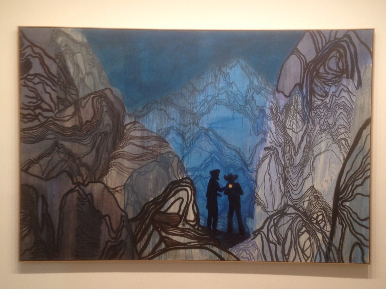
February, 24" x 48", oil on canvas, 2012. (Click on image for larger view.)

It is difficult to articulate what makes abstract art attractive. But I think it is because painting does not rely on language. It transcends rationality. Abstract painting communicates without spelling everything out in logical terms.

Some people struggle to accept any type of abstract art as good art and limit themselves to pictures which represent familiar forms, such as people, landscapes, or other recognizable things. But while some paintings which represent recognizable forms can be considered good, others may still be considered bad. These same principles apply to abstract art.

An analogy could be drawn to music: some songs have lyrics which follow linear, logical thought; others have ambiguous lyrics, while still others (instrumentals) have no lyrics at all. Instrumental music still holds the potential to move people even though words don't spell everything out.

Abstract art is somewhat like instrumental music. Although anyone could pick up a brush and paint abstract, so could anyone pick up a guitar and strum an instrumental. Good instrumentals still require musicians to understand and control their instruments. Likewise, in order to create a good abstract painting, an artist is required to understand and control the paint, even if the paint is thrown or dripped on the canvas like Jackson Pollock.

I think perhaps abstract art is susceptible to the cold shoulder because we, as humans, have been trained to use our eyes to make sense of the world. From birth, we are bombarded with visuals on a daily basis and sort through the chaos by placing definitions on what we see or filing this information into familiar categories. We live in a society based on logic and reason.

Society, however, is a human construction and not an entirely truthful representation of life on Earth. Logic and reason do not encompass all experiences of living on this planet. Moreover, our eyes are highly sensitive organs (probably the most complex of our senses) trained to decipher and distinguish between slight differences in color, shade, and tone. Visual art feeds into this and becomes a form of communication through the sense of sight. Abstract art then breaks free of logical constructions, rationality, and the limitations of language - potentially becoming a form of communication on a complex level.

A painting, whether completely abstract or one with recognizable forms, is an object (not an image), with a composition and texture, a relationship of repeating and contrasting elements. In this regard, abstract painting is the same as any other form of painting. It is therefore also true that many bad abstract paintings have been created (I hope mine depicted in this post does not fall into this category, but I leave that to others to determine). That itself is insufficient reason to discount abstract painting altogether.

Painting in general has been around for a long time with a long list of masters. Our standards are high. Abstract painting is relatively young (less than 100 years old) and will eventually form a family of agreed-upon masterful works. No matter what style we consider at this point, the bottom line is: Painting is hard!

February, detail (click on image for larger view):


February, detail (click on image for larger view):


February, detail (click on image for larger view):

Friday, February 10, 2012

Doodle of the Day - Johnny Utah's Big Disappointment


The County of Los Angeles recently lifted an all-out ban on playing with footballs and frisbees on the beach, allowing for beach-goers to toss balls on beaches in Los Angeles County during the winter off-season.

But the only thing this really does is bring to everyone's attention that a law actually exists which prohibits them from playing with balls on the beach during the rest of the year! Most people, me included, had no idea there is actually a "ball playing restriction". Apparently, when you go to the beach, you're supposed to sit there like a mannequin.

County Code section 17.12.430 provides: "It is unlawful for any person to cast, toss, throw, kick, or roll any ball, tube, or any light object other than a beach ball or beach volleyball upon or over any beach..."

With the ongoing budget crisis in California, I find it hard to believe that government money will actually be spent enforcing this law. On the other hand, now everyone is actually aware that the law exists. So, Los Angeles residents, once June rolls around, watch out for the cops when you go to the beach. Or make sure to play all your football games with a beach volleyball! But don't expect to be seeing Johnny Utah.

Thank you for following the Doodle of the Day and the paintings, sculpture, drawings, works in progress, reviews, and other art by Los Angeles artist Lucas Aardvark Novak :) To see older blog posts and other doodles, click HERE.

Monday, February 6, 2012

Finalizing the Review: Matthew Ritchie v. Daniel Richter (Part 3 of 3)

In finalizing my review of the work of both Matthew Ritchie and Daniel Richter, several similarities between the two were apparent. Each painting was professionally constructed with thick (two-inch) stretcher bars and high quality canvas or fine linen. As should be expected from such acclaimed painters, their work viewed from all angles has a professional and finished quality in terms of construction and craftsmanship, even though their painting techniques may appear haphazard and rapid.

In their techniques, each artist uses numerous layers of thin washes. This creates an illusion of depth on the flat plane of the canvas, providing both strong and subtle fluctuations and variations in the paint, creating complexities in the overall completion of the painting. This gives the effect that the canvas is a window to a stage, even though the paintings still contain abstract elements. In a sense, their work combines the flatness of early abstract art with the three dimensional illusion of pre-impressionist art:


With respect to the artistic experience, however, their works differ. While Richter comments on current politics, corruption, and warfare, Ritchie explores the nature of human existence.

Richter’s work provides a critical view of world powers, making statements about world leaders…


…while Ritchie’s work has a more organic feel, asking questions and trying to make sense out of life:


As a whole, I thought Richter’s paintings were more interesting than Ritchie’s. This was not because of the subject matter. And as described in my last post, the paintings were not entirely impressive. But it was because, for the most part, Richter’s application of layers created more complexities and subtleties in the paint. And when viewing the paintings as a group, Richter’s provided more of a sense that each painting was unique, whereas Ritchie’s paintings felt that, if you’ve seen one, you’ve seen them all.

But while Richter only exhibited paintings, Ritchie’s exhibition differed in a positive way by incorporating different media, unifying painting, sculpture, animation, and installation in creating an entire environment within the exhibition space. The ambiguity of Ritchie’s work, his motivation and ideas, served to be more thought-provoking and prompt more questions than some of the spoon-fed statements of Richter.

For these reasons, I cannot say that I enjoyed Richter’s exhibition more than Ritchie’s. Each exhibition was an inspirational artistic experience, with aspects to embrace and some to reject.

Thanks for reading. Hope you're enjoying the reviews, paintings, creations, sculpture, drawings, works in progress, Doodle of the Day, and other art by Los Angeles artist Lucas Aardvark Novak :) To see older blog posts click HERE.

Friday, February 3, 2012

Continuing the Review: Matthew Ritchie v. Daniel Richter (Part 2 of 3)

Yesterday I posted Part 1 of this review of the work of Matthew Ritchie and Daniel Richter, two well-known artists of the international contemporary art scene who recently exhibited their work in Los Angeles. Continuing the comparison...

Daniel Richter at Regen Projects, Los Angeles:

German artist, Daniel Richter’s current exhibition consists of ten paintings [all approximately 200 x 300 cm (6.5' x 10')], the subject matter referencing current events, including war and politics, world powers apparently working in cahoots while engaging in ongoing warfare.

More interesting than the subject matter, however, is how he completed the paintings, such as the numerous applications of layers. Many of the paintings are an adventure of complexities leaving much open to interpretation and completion by the viewer:


At times, however, the cohesiveness of the overall picture is broken by the combination of abstractions, flat shapes, and drippings of color. Richter’s relentless addition of abstract shapes and drippings can get overbearing. Each shape and color loses its power and effect from the maze of numerous other haphazard shapes and colors, as if Richter’s trying to prove sophistication by the sheer number of brushstrokes or applications of paint. Perhaps Richter could benefit from a reminder of the famous quote by Leonardo da Vinci, that “Simplicity is the ultimate sophistication.”

Maybe his work would be more effective had he wholly committed to the maze of numerous haphazard shapes and colors (Jackson Pollock-like). But Richter attempts to simplify the chaos and bring form to the abstraction by representing human forms through flat applications of black paint:


The flat black, however, sometimes feels too heavy and not in harmony with the rest of the picture, as if the black shapes are mere cut-outs, pasted onto the canvas after filling it up with abstract shapes and drippings. And, in anticipating the problems with the flat black shapes, he made sure to use overly bright and vivid, almost fluorescent, drippings and swaths of color:


To me, the bright colors in the drippings and abstractions are too artificial, maybe even decorative and kitsch for such dark themes of war and corruption in politics. I sensed that Richter wanted to comment on such dark themes, but in doing so felt he needed to include very bright colors to holler for the viewers’ attention.

But bright colors do not inherently carry better principles than grayed colors. The impact of any color depends on what is next to it. The attention immediately gained by a collection of bright colors is merely superficial. It is similar to a pop song on the radio that is immediately catchy to the ear but quickly gets boring because of its lack of depth.

It perplexed me that Richter chose to go overboard with the bright colors, mainly because his past work of similar dark motifs does not rely on bright colors as a crutch. It could be that Richter, being from Germany, has the idea that the majority of the Los Angeles crowd, indulging in materialism, suffers from such short attention spans that bright colors are required in order to compete for their attention. Perhaps he’s on to something...

Stay tuned for Part 3 of this post, comparing the similarities and differences of Ritchie’s and Richter’s work.

Thank you for following the reviews, paintings, creations, sculpture, drawings, works in progress, Doodle of the Day, and other art by Los Angeles artist Lucas Aardvark :) To see older blog posts click HERE.

Thursday, February 2, 2012

Matthew Ritchie v. Daniel Richter: A Review (Part 1 of 3)


In recent weeks, two well-known painters of the international art scene exhibited their work in Los Angeles: Matthew Ritchie and Daniel Richter. Each is an acclaimed contemporary artist (and relatively young) who prices his paintings for over $100,000. While monetary value is not an indicator of good quality and taste (as demonstrated by Damien Hirst’s “spot” paintings currently at Gagosian galleries), both Richter’s and Ritchie’s names can be found in almost every contemporary art book. They are among the so-called leaders of the international contemporary art scene. So, given the opportunity to see their work in person, within a span of just a couple weeks, I was able to review what they are currently creating, and compare and contrast their work-product and styles...

Matthew Ritchie at L&M Arts, Venice, Los Angeles:
A combination of painting, sculpture, animation, and installation, Ritchie’s exhibition was installed in two rooms: the west room displaying 8 paintings and a sculpture under standard lighting; the east room with 4 paintings and a sculpture, dimly lit to allow for projections of animations within the floor and wall installations.

In the west room, each oil painting was about 8 feet tall by 5 feet wide on fine woven linen, abstract elements hinting at realistic elements like angel wings and biomorphic shapes:


Each painting had numerous layers of very thin washes and glazes. Flecks of paint perhaps sprayed using his finger on a toothbrush:


The paintings all had a clean surface, uniform flat texture and professional appearance, but as individual works of art they lacked a sense of uniqueness or individuality. Each painting seemed to be a clone of the one next to it, a disappointing characteristic of the artistic experience and contrary to his biomorph motif – it causes you to feel that if you've seen one, you’ve seen them all. The paintings made me imagine Ritchie treating his studio like an assembly line – lining up a bunch of canvases, using the same palette of colors and process to fill them up, just enough to satisfy the wall space in the two rooms at the gallery.

On the other hand, the east room displayed Ritchie’s combination of different media. Whereas the focus in the west room was the paintings, the hierarchy for the viewers’ attention in the east room was unclear – the projections and installation were as important, if not more important, than the paintings. The room was a unified artistic experience of various methods of communication, as if walking into Ritchie’s world to see what he sees, rather than moving from one stand-alone clone to the next.

The following 1 minute video shows a glance of the east room experience:


Stay tuned for Part 2 of this post, a comparison of Ritchie’s exhibition to Daniel Richter’s exhibition currently at Regen Projects in Los Angeles.

Thank you for following the reviews, paintings, creations, sculpture, drawings, works in progress, Doodle of the Day, and other art by Los Angeles artist Lucas Aardvark :) To see older blog posts click HERE.