Wednesday, August 31, 2011

Abstract Painting - Progress in the Studio


This photo shows the early stage of a painting on wood panel I am currently working on in my studio.

In abstract painting, the process is like a leap of faith in that I don't have a specific vision of what the completed painting should look like in the end. This is what makes abstract art both challenging and intriguing. Early on, I do have an idea of what the next few stages will be in the painting process. That allows the current stage to be completed with confidence. This is important because if the painting is young and the next stage is unknown, the painting becomes lost and may remain in limbo forever.

The painting here is young but the next few stages are planned. First, large shapes of color were applied, wiped, and scraped to establish the underpainting. Second and third layers of cool (as opposed to warm) color have been applied again, in thin glazes. The glazing effect creates luminous colors and a sense of distance between the paint and the panel. Still, I am not too concerned with the shapes and colors at this point, as I plan to cover up most of the surface with subsequent layers and "fatter" paint using scraping and pulled-paint techniques. It has been planned that the luminous glazes of cool color should provide various backgrounds and areas of interest behind the subsequent thicker layers, where the thicker layers break up or do not cover the surface completely.

On the table you can see I am using a very limited palette at this stage -- just five cold colors, while also utilizing the white ground of the panel. Each color is translucent and perfect for glazing. Once this stage is complete, however, I will expand the palette and use several more colors, adding warmth, contrast, and more texture. The mission is to create a work of art that can stand alone in the end, holding the attention of the viewer by a striking presence and by ambiguities and prompting questions.

These are all techniques also used for painting representational figures (realism) and an example of how, to the artist, abstract painting is the same process.

Thanks again for following the works in progress, and the paintings, sculpture, drawing, doodles, and other art by Los Angeles artist Lucas Aardvark.

Tuesday, August 30, 2011

Fish v. Purse Net (unfin-ished)


Fish v. Purse Net (unfin-ished)
, 8" x 6", oil and vintage paper on wood panel, 2011.

Usually in painting, I am more interested in the way paint is applied, the juxtaposition of color, contrast, subtleties, and how the art was created. This is normally more important than what the subject matter is, why it was created or the story behind the work because art should be interesting in itself and exist independently of written material or an explanation from the artist.
Nonetheless, the subject matter of this painting indeed was the driving force. This deliberately unfinished painting represents an unfinished issue.

The oceans are huge and it is easy to assume the fish numbers are infinite. But those of us on the Pacific coast are familiar with the collapse of salmon populations, and those on the Atlantic know about the collapse of the cod. Overfishing continues to destroy big fish populations at an exponential rate, and some species, such as tuna may not be able to recover once their breeding populations, are gone in just a few years, unless we, as a global society, are willing and able to join forces to implement strategies for their recovery, along with legal consequences for violations. Certainly the biggest obstacle is enforcement of these laws on the open seas. However, there are also alternative ways to maintaining sustainable fish populations.

As millions of people rely on the oceans as their principle food source, the health of the oceans' ecosystems directly affects to the health of the human race. For more information about how to contribute to sustaining fish populations, visit Greenpeace.

Thank you for following the chronology of the paintings, drawings, sculpture, and art of Los Angeles artist Lucas Aardvark.
Monday, August 29, 2011

Doodle of the Day - Gettin' the Week Started...


It's Monday and time to doodle again :)

The weather in 2011 has been unreal. From hurricanes in New York to massive floods in Mississippi, flocks of birds have been falling from the sky and schools of fish have been washing up on shores. Maybe the Mayans had it right about 2012! (Aside: make your sacrifice to the Heavens today by clicking the "Donate" button on this page and following the easy 1-2-3 steps.)

Yesterday in Los Angeles it felt like hell. The temperature reached 110 degrees. I also heard on the news that the West Nile Virus has reached the city. But the newsman also said that the virus is not as bad as its reputation makes us believe. I always thought West Nile Virus was a disease like cholera or dysentery that would consume you from the inside out. Not so. Apparently, it's like the common cold or flu, most people survive, and some people don't even get sick! See, there IS good news after all!

You can click on the image for a better view. Have a great week. Thanks again for viewing the daily Doodle of the Day and the paintings, drawings, sculpture, and art of Los Angeles artist Lucas Aardvark.

Friday, August 26, 2011

Doodle of the Day - For Smartphones...


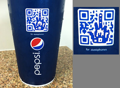
I'll admit that I was kind of annoyed that I was required to have a smartphone to partake in Pepsi's matrix adventure and be rewarded with the mysterious goodies they would surely be offering for free at the end of the digital rainbow!

Yesterday at lunch, while drinking my Pepsi, I noticed the "Quick Response Code" on the cup, that strange square matrix barcode designed to be scanned by phones. But I still use my trusty ol' flip-phone, so I wondered what good this matrix barcode did me. Nothing I could think of. I suppose Pepsi caters to people with smartphones. Perhaps they have a deal with Apple or Google or Verizon or AT&T.

Maybe I felt left out, I'm not sure why, but I pulled out my flip-phone to take a picture of that matrix barcode, as you can see above. (Yes, flip-phones DO have the capability of taking pictures, albeit mediocre ones at best.)

Then I turned the cup around to look at the other side of it, and that's when I saw what Pepsi provided for ME!...


You can click on the above images for a better view. Those of you who have scanned barcodes like this before, I'm interested in finding out what goes on in those smartphone virtual VIP rooms. Let me know.

Thanks again for viewing the Doodle of the Day and the daily art, drawings, and paintings of Los Angeles artist Lucas Aardvark!

Thursday, August 25, 2011

Obscene Art - Why Painting Must Have More Artistic Value Than Film


Obscenity, 8" x 6", oil and vintage paper on wood panel, 2011.

Artists are constantly questioning what art is. There is no satisfactory definition. Art could arguably be the juxtaposition of someone's roadkill on the highway. So what the heck is the definition of art in the law?

The newest edition to my "obsolete law book" series, this painting incorporates a Court of Appeal decision from 1976, People v. Kuhns, about the criminal prosecution of a man selling obscene material at his adult video store, in violation of California Penal Code. The obscene material was discovered through law enforcement investigation, when police officers in Santa Cruz entered the store and purchased it.

But the obscenity statute is vague because it inevitably must be balanced against the First Amendment right of free speech. The courts have attempted to define obscene material as applying to: "works which, taken as a whole, appeal to the prurient interest in sex, which portray sexual conduct in a patently offensive way, and which, taken as a whole, do not have serious literary, artistic, political, or scientific value."

So based on the definition, a work is obscene if it lacks “serious artistic value”. On the other hand, it is not obscene if it has some serious artistic value. How can a jury decide what has serious artistic value and what does not? It seems impossible.

Pressing the idea that anything the artist produces is art, the past hundred years have embraced a broader, more inclusive assessment, where just about anything has been accepted as art. This concept developed with the Dada Art Movement beginning around 1915. It involved probing the boundaries of art and taunting artistic conventions, and it was one of the primary goals of Dada to avoid the labeling and legitimizing of the artistic establishments. AndrĂ© Breton said, "Dada is a state of mind... Dada is artistic free thinking... Dada gives itself to nothing.” Probably the most notorious artwork associated with this idea is The Fountain by Marcel Duchamp, a readymade urinal he signed, dated, and called "art".

If Duchamp could place a readymade urinal in a gallery in 1917 and pass it off as art, imagine how far artists have explored this idea since then: a naked doll is wrapped in barbed wire and placed in an art gallery; a man films himself tumbling off a roof; a woman paints a portrait of herself performing sex acts with an animal.

If the woman had filmed herself instead of painted, would her work then lack “serious artistic value”? If so, wouldn’t that mean that painting has inherently more artistic value than film? I know many people who would take issue with that!

Wednesday, August 24, 2011

Doodle of the Day - Watery Eye of the Tiger!


Every day the sports news discusses how Tiger Woods needs to get back on track. He has plummeted from the pinnacle of prosperity, revealing his deceit, schemes, lusts, and desires on the way down, those which he had kept concealed for so many years behind his flawless, prince-like facade.

Tiger spent time away from golf, went to sex therapy, had a divorce and a surgery or two, and apparently worked on picking up the pieces. When he returned to golf he struggled, but everyone figured it was just a matter of time before he returned to form as the number one golfer in the world.

Some thought he initially struggled on purpose for sympathy points, a public relations move to win back his fans and eventually, his sponsors. But that theory no longer seems accurate, as Tiger hasn't won a tournament in almost two years. Two weeks ago at the PGA Championship, he missed the cut by seven strokes! His world ranking is now 36, the lowest it has been in 15 years. The year 2011 has been an aberration for Woods, and his complete collapse is as newsworthy as his past dominance. Although the media hasn't been able to pinpoint what Tiger is doing wrong on the golf course, perhaps the explanation is as simple as karma.

By now we all know that Tiger Woods is human. And yes, he cries too!

For a larger view of the doodle, click on the above image. Feel free to "Like" Lucas Aardvark Art on Facebook and post comments there or on this blog. Thanks again for viewing the Doodle of the Day and the daily art, drawings, and paintings of Los Angeles artist Lucas Aardvark!

Tuesday, August 23, 2011

Doodle of the Day - The Wonder Years


Yesterday was my younger brother's birthday, and I was reminded of when he was an infant having recently arrived at our home, I was little, and my older brother influenced my every move in life. It's a wonder how we survived those childhood years without losing any limbs or being shipped off to military school!

Click on the image for larger view. Comments are welcome, and feel free to "Like" Lucas Aardvark Art on Facebook. Thanks for viewing the Doodle of the Day and the daily art, drawings, and paintings of Los Angeles artist Lucas Aardvark!

Monday, August 22, 2011

Avoiding the Clones! Pre-Production and Constructing A Wood Panel


Sufficient pre-production and preparedness, or a lack of it, can make or break any project. One of the most important elements of painting is constructing and priming the painting surface. The pre-painting stage cannot be ignored, as it plants the seeds for a painting to develop its unique character!

For example, go into any art store, such as Blick, and find the canvas section. This section has stretched and primed canvases ready for painting, giving us the option of skipping the entire pre-production process altogether. The problem I have with these ready-made canvases is that they are mass machine produced, clones created with standard dimensions and impeccably uniform surfaces. Sometimes they are made with weak wood stretcher bars or cheap canvas. Most of the time, that drab uniform surface of a clone will remain in the texture of the completed painting. A painting should be a unique individual object, not an outgrowth of a clone.

So, the best way to avoid the clone is to construct and prime each painting surface individually. Here, I've decided my next painting will be on a solid wood panel.

Since the painting will be an addition to the "obsolete law book" series, I want it to remind us of the bookshelves on which these books once sat, so I decided to use the bookshelves themselves as the painting surface.

Here is a synopsis on how it was constructed:


After aligning the three bookshelves together, I used an electric miter saw to cut 2x2 bars to the correct dimensions. These bars are used for reinforcement and to hold the panels together. I used wood glue to attach everything, holding it all in place with clamps and masking tape. After the glue dried, I nailed the reinforcement bars in place. But because nails may slip out over time if the wood warps slightly, screws are necessary to prevent this by minimizing warping:


The panel was then flipped over and the surface was sanded down, smooth to the touch and free of splinters. After the sides were also sanded, the construction stage was complete. With dimensions of 48" x 33", this is what it looked like:


With a sturdy wood panel constructed, priming the surface was the next stage. I used three layers of gesso, sanding in between layers. Careful consideration is given to priming, as it will affect the texture of the final painting. In this case I used an old brush to spread the gesso in a smooth but slightly uneven manner with subtle irregularities. This sets the stage for the painting to develop its unique qualities in texture and presentation.


And now it is time to paint!

Friday, August 19, 2011

Doodle of the Day - Just Garbage


The Great Pacific Garbage Patch is a real patch of floating garbage the size of Texas in the Pacific Ocean. It is probably not the proudest creation of the human species, nor is it the happiest subject to think about on a Friday afternoon. But the world evolves and adaptability is its virtue! After my careful scientific studies, I have discovered that the garbage patch may be the answer to the plight of the polar bear from global warming!...

For more adventures from the Bipolar Bear and Taffy, check out my comic book "Curse of the Bipolar Bear" at my Etsy shop!
Have a great weekend!

Thursday, August 18, 2011

Doodle of the Day - Fat Company


Stocks have plunged again, unemployment is sky high, and it appears we may be in need of a modern day Steinbeck to write a contemporary version of The Grapes of Wrath. While I was eating lunch, I couldn't help but overhear part of the conversation of three business-persons at another table. At first I assumed they were speaking about the economy and their business, but after thinking about it later, I wasn't so sure. It amused me nevertheless...

Wednesday, August 17, 2011

Wildlife Alive


To most artists, the environment, nature, and wildlife are very important and inspirational. The newest edition to the obsolete law book series, this painting incorporates a Supreme Court decision from 1976 about the overkill and depletion of many animal species in California. This was just four years after the federal government banned the use of DDT as a pesticide because of its serious impact on wildlife, such as bald eagles which faced near extinction in California.

Wildlife Alive, 8" x 6", oil and vintage paper on wood panel, 2011.

Tuesday, August 16, 2011

Doodle of the Day - A Bundle of Joy!


The US Postal Service seems to be advertising a lot more than it did in the past, promoting the new services and rates it now provides. But the advertisements don't say anything about the CUSTOMER SERVICE you will encounter when you visit the post office! I had to go there today. As I stood in line for a while, I noticed the postal employee, Joy, wasn't the most cheerful person, probably because she was the only one working the line. She kinda reminded me of a female version of Newman from Seinfeld, and she amused me because she looked like a real-life cartoon. Drawing her portrait would be simple!

Then, when I reached the counter, I had a few questions about sending my mail and changing my address. I found that there was a very simple answer for everything...

Monday, August 15, 2011

Daily Doodle (VEGAS Edition)


Casinos are intriguing places. The concept behind a casino is strange - it is a place where people often drop hundreds of dollars in a matter of minutes and receive nothing in return, except maybe an alcoholic beverage and the stench of stale cigarette smoke embedded in their clothes. I spent the weekend in Las Vegas, lost my share of cash, and couldn't help but laugh at the scene. Shamelessly fueled by money yet scantily hidden behind flashing lights, candy-wrapped devices, and sexy costumes, the casino is a master at disguise. We are just monkeys funneled into its trap, incapable of learning from the electric shocks. For some reason, however, I want to go back!

Friday, August 12, 2011

Doodle of the Day


The courthouse in Los Angeles can be a place to find funny characters. I had to go to court yesterday, and several lawyers were waiting in the hallway before the courtroom opened. One lawyer in particular caught my attention. Wearing a colorful tie, he talked and talked loud enough for everyone to hear, going from one lawyer to the next, seeming to be very comfortable in this environment. He strutted around like a rooster as if he owned the place.

But the confidence he exuded in the hallway vanished once we were in the courtroom and the judge called his case. The papers the guy filed must've been below par, as the judge saw right through his peacocking act!

Thursday, August 11, 2011

The Daily Doodle


Beverly Hills is known for its fashion and starting trends, often the center of unbridled materialism. Recently I attended an art opening at a gallery there. At some point my friend texted me, and I pulled out my phone to text him back. As I stood there punching the numbers on my trusty ol' FLIP-PHONE, I had the uneasy feeling that I was being judged. (As if I was in Court, lol!) I felt stupid that I cared what people thought about my "ancient" phone.

Why did it bother me? Not sure. The phone gets the job done. So I don't have a GPS on it -- that's fine, I have a good sense of direction. So I don't have internet on it -- that's fine, I have a computer at home. Nevertheless, I admit that I felt like a dumb dinosaur that day, embarrassed by some insignificant product I owned. One day I suppose I'll have to get a new phone. But not today!

Wednesday, August 10, 2011

Artistic Study -- Honing Skills Through Portraiture


My friend Abigail was nice enough to sit for half an hour to allow me to quickly sketch her portrait. This is what was created in that time limitation.

Even though my current direction in painting is in the realm of abstraction, it remains necessary to know how to draw! This includes drawing from life, still-lifes, landscapes, interiors, figures, and the ever-challenging portraits.
Banksy made an interesting observation when he said: "All artists are willing to suffer for their work. But why are so few prepared to learn to draw?"

Drawing a portrait with a fixed time limitation is indeed a challenge and an excellent way to hone drawing skills. With drawing expertise comes the knowledge of line, shade, and composition -- the building blocks for creating a good painting.

To an artist, painting something completely abstract is almost the same as painting something realistic. Both are simply illusions created on a flat plane using color -- it is texture, brushstrokes, line, juxtaposition of color, contrast and subtleties which give a painting life, whether it is a portrait of a person we recognize or a form of something incomprehensible. The only difference, as I see it, is that an abstract painting is a blind process, meaning there is no final image the artist is aiming for or needs his painting to look like (unless he is using an abstract photograph or Photoshop -- ugh!); rather, painting abstract is a bit like a leap of faith, using a set of tools and skills to hopefully create something meaningful in the end.

The necessity of having drawing skill is further exemplified by the great Pablo Picasso. He could draw like the old masters when he was 15, yet he still decided to abandon the representational approach as he helped pave the way into abstraction, becoming the most famous artist of the 20th century. He did this with drawing expertise.

Tuesday, August 9, 2011

The Daily Doodle


Strolling shirtless across the crosswalk at a snail's pace, his muscles glistening in the sun and swollen from his probable recent discovery of steroid injections, it was clear this guy was holding up traffic on purpose. The people in their vehicles waited patiently for him to pass, but he twisted and flexed his torso with every mini-step he took.

I was standing across the street amused. For a moment I felt kinda sad for the guy, but then I figured he brought it upon himself. So then I doodled this and posted it on the internet!

Monday, August 8, 2011

Doodle of the Day


Gathering, organizing, lifting and loading; cleaning, scrubbing, sweeping and vacuuming -- this is how I spent my entire weekend, moving from one apartment to the other. I approached it thinking it wouldn't take very long because I don't have too much stuff. Boy, was I wrong! Stuff kept appearing -- old paintings, art supplies, hockey cards, fishing gear, boxes of books, and miscellaneous junk -- melting together into one GIANT MONSTER!

Moving sure aint fun. It can be downright scary! I felt like a preyed-upon character from the Pixar film, Monster's Inc.

Friday, August 5, 2011

A Critique of Peter Doig


A contemporary artist alive today influencing me with his paintings is Peter Doig. A reason why his work is influential is because he incorporates the abstract with representational subjects, often referencing established artists in history such as Klimt and Mondrian, and putting the emphasis on color and HOW each work is painted, not why it was made or what the subject matter is. For example, the painting above is a dark picture of green-faced men in costumes, yet it is the way the picture was made, i.e, rich blotches and colors dripping with an "unfinished" quality, a ghost-like tree, and contrasting yellow-orange against a midnight blue with an accent from a lavender stone, that makes it interesting. It is peculiar why these men are standing in the field in the evening, their faces green, in front of a rock wall -- aspects remain ambiguous, capturing the viewer's attention by prompting questions.

Born in 1959 in Edinburgh, UK, Doig lived in Canada (nice!) for a good portion of his early years, and it is probably from this experience that directed him to create many paintings referencing the outdoors and derived from landscapes. Art critics have sometimes criticized or given him criticism for representing nature with abnormal colors, such as painting deer red. But his appoach to representing simple subjects is unique. The picture below is a simple subject which appears to be a person perhaps skating on a frozen pond in winter. We don't really know much about this person other than he is alone. And even though the scene is a white winter, the painting nevertheless teems with color through reflections and splotches.

Should Mr. Doig ever read this blog post, critique, or whatever you call it, I declare to him that I shall one day have a painting of mine on the same wall as his, for viewers to decide which one they like better!

Thursday, August 4, 2011

Doodle of the day


This is a doodle of the weird guy at the coffee shop this morning. He looked funny with his funny-looking mutt. Squeezing his pooch close to his breast, it appeared as though the dog was ordering the coffee. This little scene, if you would even call it that, was just a fraction of my day -- it occurred in a flash, like the random appearance of a bird in the sky, and then he was gone and I was on my way. But the image stuck in my head and morphed into characters not unlike those in Family Guy, The Simpsons, or The Far Side.

Later during my lunch break, the image still lingering, I scribbled this doodle. It was created using a standard No. 2 pencil and a bic pen.

Wednesday, August 3, 2011

Glazing an Oil Painting


A favorite oil painting technique that I use is known as glazing. It has been a technique used since oil painting was first invented, yet it seems many contemporary artists have abandoned it. The glazing effect can be likened to placing thin pieces of colored glass on top of each other. So in painting terms, it is the process of stacking up thin layers of translucent color.

The glazing technique has several advantages, one my favorites being that it creates a glass-like plane while creating the illusion that the surface is further away. This works well, for example, when I want the color brown to have a luster rather than the simple flat brown created by mixing opaque colors from the tube. While glazing can be accomplished with any pigment, I prefer some more than others -- colors that are inherently translucent as opposed to those which are opaque. For example, translucent colors include burnt sienna, veridian, alizarin crimson, ultramarine blue, and payne's gray; opaque colors include titanium white, cadmium red, and yellow ochre.

Once the pigment is selected, it is important to then dilute it with a medium. Typically, I use one of two different methods: 1) my "trade-secret" mix of galkyd, linseed oil, and [secret]; or 2) straight liquin. Once the correct viscosity is mixed, the pigment can be applied to the canvas in various ways using different types of brushes, such as those for scumbling, wiping, or detail. And, once the layer dries, it may be ready for another "pane of glass"!

Examples of glazing can be seen in my pictures below where paint is applied over text -- this allows the text to be readable underneath different colors. However, more complex examples can be seen in the work of Jan Vermeer here.